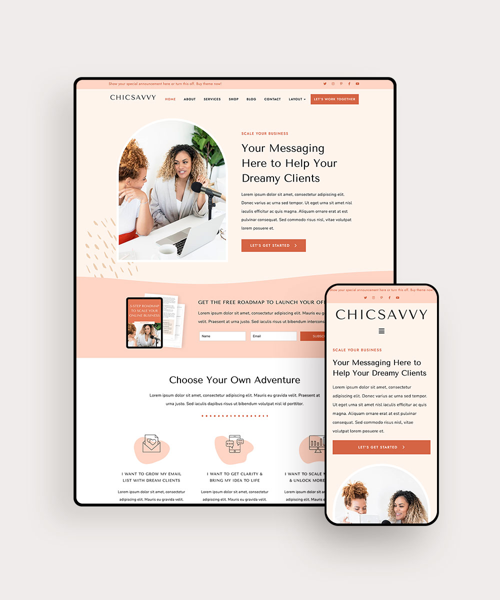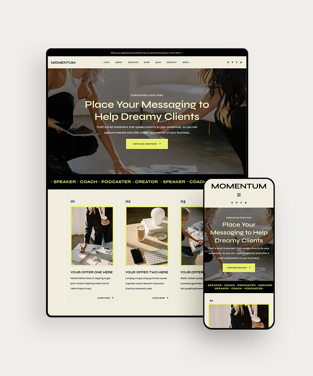
You have probably seen it happen: two businesses use the same website template, but one feels completely different from the other.
One looks polished but still has that unmistakable demo-site feeling. The other feels specific to the business behind it. You can tell whose website it is without seeing the logo.
That difference usually does not come from a complete redesign. It comes from the decisions made after the template is in place.
What if my website still looks like a template?
It is a fair concern. You want the time and cost savings that come with starting from a professionally designed template, while still having a website that reflects your business.
You do not need to rebuild every page to get there.
A few well-chosen changes can shift the overall look of your site. Here are 4 places to focus if you want your Bluchic template to feel more like your business and less like the demo.
PIN THIS POST FOR LATER!


1. Start With Your Brand Colors
Changing the colors is one of the quickest ways to give a template a different personality.
A demo might use soft pinks and warm neutrals, but those colors are there to show you how the design works. They do not have to become your brand palette.
Start with the colors you already use in your business. Look at your logo, brand guidelines, social graphics, or anywhere else your visual identity appears.
Then decide where those colors make the most sense on your website.
You might use your darkest brand color for headings and buttons, a lighter shade for backgrounds, and an accent color for smaller details such as links.
You do not need to use every brand color everywhere. A simpler palette often makes the site easier to navigate and keeps the design from becoming visually noisy.
The change can be surprisingly noticeable. Take a template with a soft, feminine palette and switch it to deep green, cream, and charcoal. The layout stays the same, but the impression of the business changes.
You can change the visual direction without rebuilding the structure underneath it.
That is one of the reasons a good website template can be such a useful starting point.
Related post: 6 Real Examples of Website Templates for Virtual Assistants
2. Change the Fonts
Fonts can change the character of a website almost immediately.
Look at the same template with a modern sans serif heading font, then imagine it with an elegant serif. The sections are still in the same places, but the overall impression is different.
Choose fonts that suit your brand and are comfortable to read. A business with a clean, modern identity might use simple sans serif fonts, while a more editorial brand might pair a distinctive serif heading with a straightforward sans serif for body copy.
You do not need a long list of fonts. Two well-chosen typefaces are usually enough: one for headings and one for body text.
Once you choose them, use the same font system throughout the site. Your homepage should not suddenly switch to a completely different heading style on the services page.
If you are still deciding what works for your brand, check out our guide on how to choose fonts for your website.
Your fonts should feel like a deliberate part of your brand, rather than settings you forgot to change from the demo.
3. Replace the Demo Photos With Images That Feel Like Your Business
The photos in a template are there to help you picture the finished design. They are not necessarily the images your business needs.
Start by looking at the role each photo plays on the page. Does it introduce you? Support an offer? Show your work? Add visual interest to a section that would otherwise feel text-heavy?
Then choose images that fit that purpose.
For example, your website might include:
- A photo of yourself on your About page or near an introduction
- Images of your work or workspace that give visitors a glimpse of what you do
- Behind-the-scenes photos that show part of your process
- Lifestyle images that fit the mood and message of your brand
- Stock photography for sections where you need supporting visuals
If you are using stock photos, look for a collection that feels cohesive rather than choosing each image in isolation. The photos do not have to be identical, but they should feel like they belong to the same visual world.
For curated stock photography, you could explore Haute Stock.
You can also check out our guide on how to choose stock photos for your website for more tips on finding images that work with your brand and website.
Replacing the original demo images is one of the simplest ways to make a familiar template feel more specific to your business.


4. Make Small Layout and Interaction Changes
You do not have to keep every section exactly as it appears in the demo.
Look at the page from your customer’s point of view. If testimonials are important for building trust, you may want them closer to your offer. If the demo has three service columns but you only have two services, a small layout adjustment may make more sense.
Small layout changes can make a template feel much more tailored to your business.
You can also add subtle movement to certain parts of the page. A button that responds on hover, a scrolling testimonial section, or a gentle animation can add polish without distracting from the content.
This is where Bluchic’s Elementor Pro Containers can be useful. These pre-built, customizable sections can be added to existing WordPress pages, giving you an easy way to refresh one part of your site without redesigning the whole page.
Use a scrolling testimonial section to highlight client success, or stacking cards to showcase services or course modules with a little more interaction.
Keep the effects purposeful. A little movement can add personality, but it should never compete with your content.


What Should You NOT Customize?
This is where it is easy to get carried away.
You change the colors, then adjust the buttons, then start moving sections around. Suddenly, you have spent an hour tweaking details that most visitors will never notice.
If something already works well for your business, leave it alone.
You probably do not need to change every font size, button, spacing value, or design detail.
Before making a change, ask what it improves. If it does not make the page easier to use, clearer to understand, or more aligned with your brand, you may not need to change it.
A website can feel personal without being endlessly edited.
Related post: 7 Small Business Homepage Mistakes (And What to Include Instead)
FAQs About Customizing Website Templates
It can if you leave most of the demo design untouched. Your branding, imagery, copy, and layout choices will make the finished site more specific to your business.
It depends on how much you want to change and whether your branding and content are ready. Having those pieces prepared makes the process much easier.
No. Start with the existing layout and focus on the elements that have the biggest visual impact, such as your colors, fonts, images, and content.
Start with your brand colors, fonts, and images. Then look at the layout and make adjustments where the template does not quite fit your business.
Start With a Template You Can Make Your Own
You chose a template because you wanted a head start. Take advantage of it.
Spend your time on the details that make the website recognizable as your business, then leave the parts that are already working well alone.
A visitor should be able to land on your site and quickly get a sense of who the business belongs to, what you offer, and what makes your approach different. Your colors, photography, fonts, and the way you arrange your content all contribute to that impression.
That is the real advantage of starting with a professionally designed template. You have a solid structure to work from, so you can spend your time making the important parts feel right for your business.
Ready to find a starting point? Explore the Bluchic WordPress Theme Shop and find a professionally designed WordPress theme you can customize around your business.