
If you’ve ever typed “why isn’t my website converting” into Google, you’re not alone.
Most people don’t search that because their homepage looks bad. They search it because something feels off. The design is polished. The photos are professional. The brand feels cohesive. And yet inquiries are inconsistent, or sales aren’t where they should be.
That’s when business owners start researching small business homepage mistakes or looking into common homepage design mistakes, trying to figure out what’s missing.
Here’s what’s really happening: most homepages aren’t bad. They just don’t highlight what matters most.
They look nice, but they don’t help someone decide. And a homepage that doesn’t help someone decide rarely converts.
Let’s walk through 7 small business homepage mistakes and what to include instead if you want a homepage that converts.
PIN THIS POST FOR LATER!


Homepage Mistake #1: Your Positioning Is Vague
One of the most common homepage design mistakes is choosing a headline that feels inspiring but doesn’t explain what you actually do.
When someone lands on your homepage, they scan quickly. They want to know who this is for and what they’ll get. If they have to interpret what you mean, they won’t. They’ll leave.
Your homepage should clearly answer:
- Who you serve
- What result you help them achieve
- What makes your approach different
For example, instead of staying general, you might say:
- Business coach for first-time founders who want to reach six figures without burning out.
- Conversion-focused copywriter helping course creators turn readers into buyers.
- Virtual assistant for online businesses that need streamlined systems and launch support.
Each example makes the audience and outcome obvious. No guessing required.
If you want to refine your messaging further, read our guide on how to attract dream clients with your website.
Being specific doesn’t make your brand smaller. It makes it stronger.
Homepage Mistake #2: You’re Leading With Everything at Once
Another frequent small business homepage mistake is presenting every offer with equal importance.
When services, products, downloads, and free resources are all competing for attention, your visitor has to decide where to look first. That extra thinking slows them down.
Instead, create a simple order:
- Primary offer – your main revenue focus
- Secondary offer – complementary or lower-ticket
- Free resource – optional entry point
For example, a copywriter’s homepage might flow like this:
- Website copy packages (primary)
- VIP sales page intensives (secondary)
- Free messaging guide (entry point)
This structure tells visitors what matters most. When everything is highlighted equally, nothing feels essential. A homepage that converts makes the next step obvious.
If you’re reworking your layout, our post on how to improve your website walks through practical updates you can make.
Homepage Mistake #3: Social Proof Is Hard to Find
When someone considers hiring you or buying from you, they look for reassurance.
Has this worked for someone else?
Is this business established?
Do others trust this brand?
If testimonials or results are hidden halfway down your page, visitors may leave before they ever see them.
You don’t need dozens of reviews. Even two thoughtful testimonials placed strategically can make a difference. That could include:
- Short testimonial snippets
- Measurable results
- Press logos or podcast features
- Star ratings or review counts
For more insight into usability and trust signals, this article on homepage usability guidelines is worth reading.
Trust shouldn’t feel hidden. It should be easy to find as someone scrolls naturally.

Homepage Mistake #4: You Focus on Features Instead of Results
Many homepage design mistakes happen because business owners describe what they include instead of what changes.
Features matter. But results are what motivate decisions. Instead of listing what’s included, describe what improves.
If you’re a coach, instead of listing session frequency, describe what life looks like after clients gain clarity and predictable revenue.
A homepage that converts paints a before-and-after picture. It helps your reader imagine themselves on the other side of the decision.
Related post: The Power of Visual Storytelling: Enhancing Your Website With Engaging Design
Homepage Mistake #5: Your Call-to-Action Is Weak or Competing
If you’re still wondering why isn’t my website converting, look closely at your calls-to-action.
Some small business websites either hide their main CTA button or overwhelm visitors with too many choices at once. When everything is clickable, nothing stands out.
Your homepage should guide visitors toward one primary action.
Instead of vague buttons like:
- Learn More
- Click Here
- Submit
Use language that explains what happens next:
- Book Your Strategy Call
- Start Your Project
- Browse the Collection
You can include secondary buttons later, but they shouldn’t compete with your main path. A homepage that converts feels guided, not chaotic.
Homepage Mistake #6: The Page Looks Good but Lacks Direction
This is one of the most subtle small business homepage mistakes.
A homepage can look stunning and still underperform because it lacks flow. There is no clear journey from problem to solution. Sections feel disconnected. The message feels scattered.
A homepage that converts usually follows a simple rhythm:
- Introduce who you help
- Show social proof
- Present your main offer
- Explain the result/transformation
- Invite the next step
That order helps people follow along without feeling lost.
Design supports that structure. But design alone cannot replace it. Without structure, even the most elevated homepage design becomes decorative rather than persuasive.
If you’re planning a refresh, our spring website redesign tips can help you think through the update strategically.

Homepage Mistake #7: You Designed for Yourself, Not a First-Time Visitor
After working inside your business for months or years, it’s easy to assume certain things are obvious.
But a first-time visitor doesn’t share your background. They don’t know your process, your offer evolution, or your internal process.
Ask yourself:
- Is my main offer obvious within five seconds?
- Can someone immediately tell who this is for?
- Does the navigation feel simple?
- Does the page guide them step-by-step?
If the answer is unclear, the issue may not be your expertise. It may be how the information is arranged.
A homepage that converts is built for the visitor’s clarity, not the owner’s familiarity.
Related post: 7 Ways to Show More Personality With Your Website
What a Homepage That Converts Actually Includes
After reviewing these small business homepage mistakes, here’s what most high-performing homepages include:
- A clear positioning statement defining the audience and transformation
- Visible social proof that builds confidence
- One primary offer is highlighted clearly
- A section explaining the results clients can expect
- One strong call-to-action that stands out
- A page layout that flows in a logical order
Notice that none of these elements are trendy design features. They are strategic foundations.
When those foundations are present, your homepage feels purposeful instead of decorative. That’s what builds trust and increases action.
FAQs About Small Business Homepage Mistakes
Most homepages don’t convert because visitors can’t quickly tell who the business is for or what result it offers. If people have to interpret your message or hunt for your main offer, they often leave before taking the next step.
• A strong homepage usually includes five key elements:
• A clear headline explaining who you help
• Visible testimonials or social proof
• One primary offer
• A section explaining results or transformation
• A strong call-to-action
Many small businesses use structured website templates, like Bluchic WordPress themes, because these sections are already built into the homepage layout.
A high-converting homepage clearly explains who the business helps, what result it offers, and what to do next. It also includes social proof, a focused main offer, and a clear call-to-action so visitors can move forward confidently.
There’s no perfect length, but most effective homepages are long enough to guide visitors through a simple decision process. A typical structure introduces who you help, shows proof, presents your main offer, explains the results, and invites the visitor to take action.
Most homepages should focus on one primary call-to-action. You can include secondary options, but the main action—like booking a call or viewing services—should stand out clearly.
Final Takeaways: Review Before You Redesign
If you searched for small business homepage mistakes, it’s likely because something feels slightly off on your site.
Look at your homepage and ask:
Is your primary offer obvious right away?
Can visitors quickly find proof?
Is there one dominant call-to-action?
Does the page help them move forward step by step?
Small adjustments can create noticeable shifts in how people respond.
And if you are rebuilding your website, starting with a structured foundation can save hours of second-guessing.
Our Bluchic WordPress themes are built with this exact framework in mind. Instead of piecing together sections from scratch, you begin with layouts designed to highlight your main offer, include proof naturally, and guide visitors toward action.
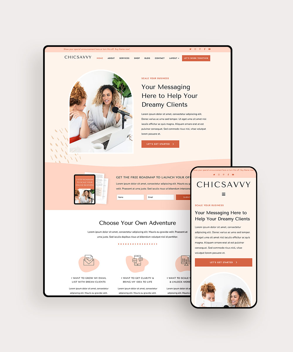

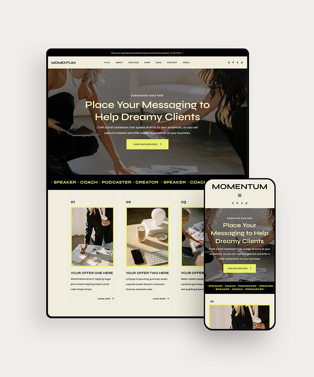

You can explore the full collection in our shop and choose a theme built for growth.
Because fixing small business homepage mistakes isn’t about chasing trends. It’s about creating a homepage that helps people decide.
And when your homepage helps people decide, conversions follow.