
Your website should be more than just a digital placeholder — it should be the hardest-working member of your team! When designed strategically, your site brings in inquiries, guides visitors toward your offers, and showcases your professional expertise.
So if you feel like your site just isn’t bringing you the traction you need, it’s time to pivot. Let’s dig into a few red flags that might be holding you back, as well as ways to improve your site once you know what’s a miss!
PIN THIS POST FOR LATER!


Red Flag #1: You’re Not Getting Inquiries or Sales
Feeling like the well has run a bit dry? If you’re not getting any inquiries or sales, even with site traffic, this is a red flag that needs attention ASAP!
It’s frustrating to know people are landing on your site but not taking the next step, like filling out your contact form or making a purchase. This often means your site isn’t clearly directing visitors on what to do next, or something else on your site, like messaging, isn’t resonating.
Try this: Navigate your site as if you’re a brand-new visitor. Can you immediately understand what your business offers and what steps you need to take to get it? This will help you notice any potential gaps!
Related post: 5 Web Design Trends that Will Boost Your Conversion Rates
Red Flag #2: You Hesitate to Show Others Your Site
Do you get excited to show off your business, or do you have a knot in your stomach when someone asks, “Where can I find you?” Is your website missing from your social media profiles because you don’t want anyone to find it?
Your website is a crucial visual representation of your brand, creating lasting impressions from the moment someone lands on it. If it doesn’t align with your current brand, and you continually hesitate to show it to others, you’re not set up for the traffic, and conversions, you need to grow.
Try this: What three words describe your website? Do these align with your brand? Do they fit with where you want your business to go? Take a moment to reflect and dig into these questions!
Red Flag #3: People Still Aren’t Sure What You Do
It should be crystal clear what you do, and what you offer, after someone visits your website. If you keep getting DMs or emails asking about what your business does, it’s time to adjust for better clarity.
Effective website copy should clearly communicate your value proposition and guide potential clients. It should speak directly to your audience’s needs and build the trust necessary to turn leads into conversions.
Try this: Ask your business bestie to scan your homepage for just 30 seconds and explain what you offer. If they struggle, it’s time for a copy refresh!
Need more help? Grab the Freebie: Bluchic’s Website Strategy Planner
Red Flag #4: It Looks Nice, But…
You invested in stunning brand photos and a beautiful color palette that perfectly captures your vibe. Everyone compliments how pretty your site is. However, it’s not generating any leads!
Remember: a beautiful website without a strategy isn’t helping you grow. You need both!
Try this: Check every page for clear calls to action like buttons, forms, or visible offers that visitors can act on. If there aren’t any, or they’re minimal, consider adding more to your site.
Red Flag #5: It’s Hard to Use on Your Phone
A potential client discovers you while scrolling Instagram and taps your profile link…only to encounter tiny text, difficult-to-click buttons, and slow-loading images. Within seconds, they’re gone!
In today’s world, mobile design matters. A poor experience causes visitors to “bounce” quickly before engaging with your amazing content. And with the majority of site visitors coming from mobile vs. desktop, this is not something you want to miss.
Try this: Test your site on your own phone, as if you were a customer or potential client. Tap buttons, scroll through pages, and assess how easy (or difficult) it is to use. If it feels clunky or frustrating, you may need to simplify the design or switch to a mobile-optimized template!
Related post: Mobile Optimization: Ensuring Your Digital Product Website Thrives on Every Device
Red Flag #6: You’re Constantly Updating, Tweaking, and Second-Guessing
You’ve spent countless hours adjusting your website, yet nothing feels quite right. One day it’s the colors, another it’s the photos and layout. You never have a site that you consistently feel confident about.
Without a clear purpose guiding the design, you’ll keep spinning in those endless, unproductive tweaks instead of serving your clients.
Try this: Step back and ask, “What is the main goal of my website?” If you can’t answer confidently, it’s time for a strategic refresh instead of just a few design tweaks.
Red Flag #7: You Haven’t Touched It in Years
Your business has grown and evolved beautifully, but new visitors would never know it! This disconnect is actively turning away the dream clients you’ve grown into serving, because your website is disconnected from your brand.
An outdated website can make your business feel less professional, even if you’ve grown significantly. Your website should look the part of your big dreams and accurately showcase your current skills and offerings. You deserve a site that reflects how far you’ve come!
Try this: Pick one small thing to update this week – whether it’s your bio, a headline, or a service description. Small wins build momentum!
Read more here: 5 Signs It’s Time to Revamp & Refresh Your Website
Get Help Revamping Your Website
The good news? You don’t need a costly, fancy redesign to address these issues! Many red flags can be resolved with strategic tweaks and clarity on your website’s purpose.
If a complete overhaul feels overwhelming, a professionally designed theme offers the perfect shortcut! Our WordPress themes and templates are expertly designed to showcase your offers and drive conversions, with a built-in strategy to guide visitors toward taking action. Plus, they look good, too!
Worried about adjusting them to fit your brand? These themes and templates are They’re easily customizable with drag-and-drop simplicity thanks to Elementor.
It’s really the best of both worlds: strategic and beautiful!

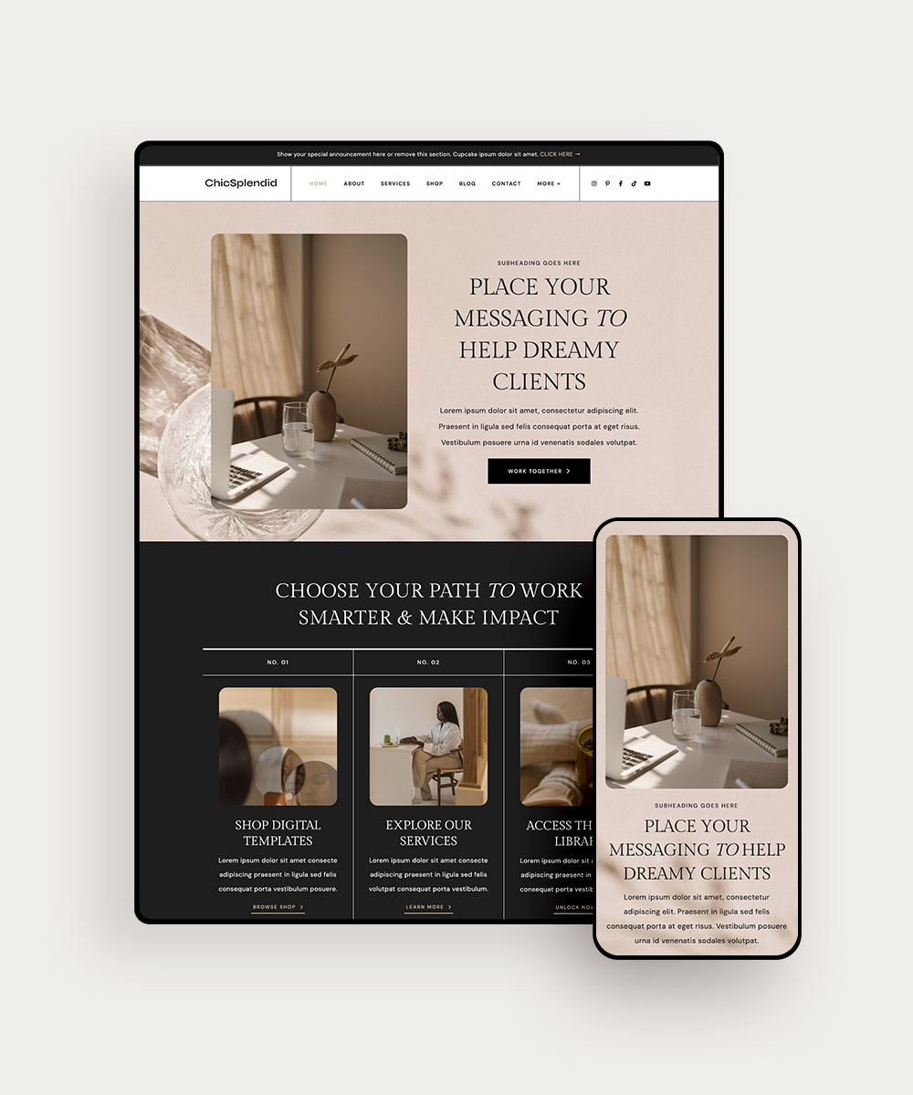

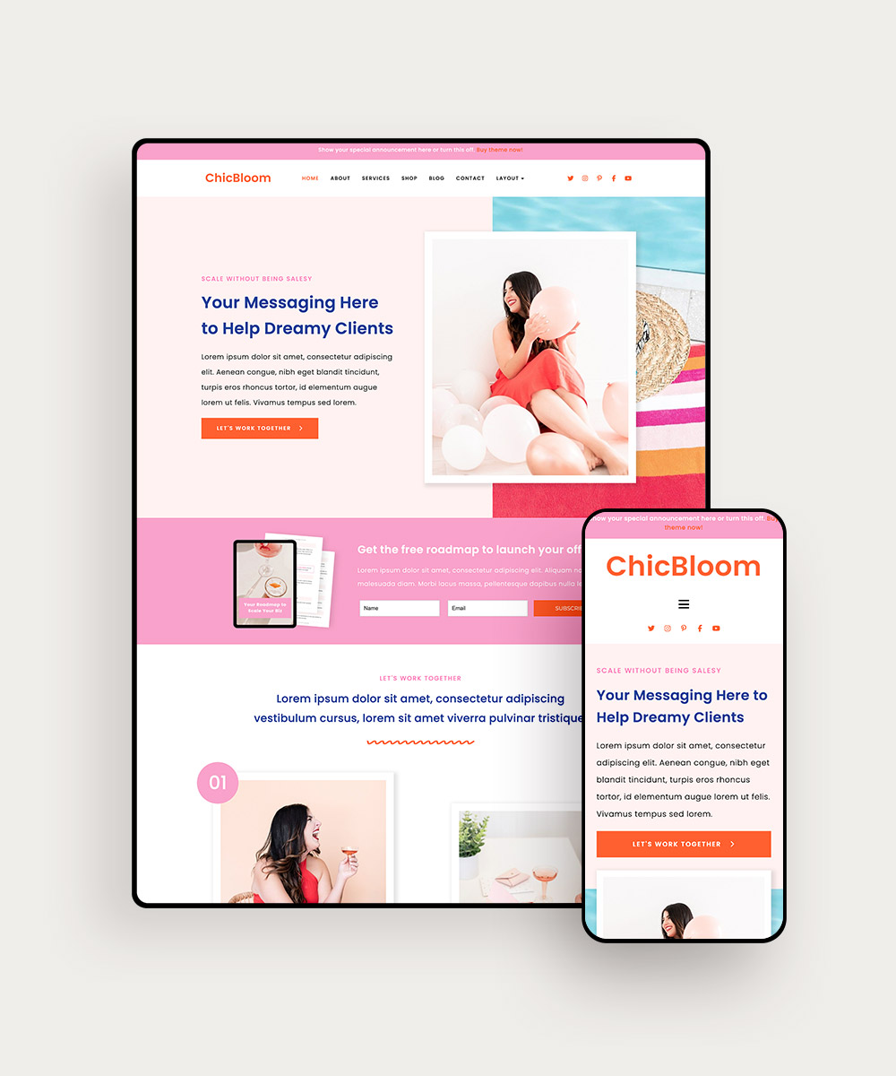
Shop all of our WordPress themes and templates here, or take our quiz here to find out which one is right for you.