We all want high converting sales pages, don’t we?
I think you’d be crazy if you said no!
High converting sales pages = more revenue for your business.
But there seems to be a mystery as to how to exactly create high converting sales pages.
What should every sales page include?
How should it be designed?
What should your sales page look like visually?
We’ve already broken down why every business needs sales funnels, how you can start building your first sales funnel, and each step of the sales funnel process (including awesome landing page examples), but today we’re going to be sharing how to design high converting sales pages.
PIN THIS POST FOR LATER!


High Converting Sales Page Design 1: Use sections
Using sections to break up your text is a great first step in designing high-converting sales pages.
People’s eyes can’t comprehend large blocks of text so their eyes tend to glaze over when they see a never-ending paragraph of words.
Sections help you break up these blocks of text so a visitor can more easily consume the information on a web page.
Sections you could include on a sales page:
- A large, captivating headline title
- Text explaining your product
- Call-to-action buttons
- Eye-catching visuals to showcase your product
- Testimonials
- Video
- FAQs
- Who your product is for/not for
- Your bio
For example, here’s a look at part of our sales page for our Canva Social Media Templates:


Remember, simple and easy to read is the goal of creating high-converting sales pages.
High Converting Sales Page Design 2: Leave white space
We love white space. As you can see on our site, we like to keep it clean and simple around here, so we have a lot of lovely white space on the sides of our blog post pages.
Having white space (or negative space as it’s sometimes called) on your sales pages gives your visitors’ eyes a rest (remember we can only consume so much information!) and allows for some “room” in the visitor’s mind to breathe before consuming the next section of information.
Using white space throughout your sales pages will enhance the other visuals and text on your pages so they stand out and are more appealing to visitors.
As you can see above from one of our sales pages, there is plenty of white space.
Don’t be afraid of not filling up every inch of space on your sales pages!
Related Post: 5 Ways to Convert Free Users Into Lifelong Customers
High Converting Sales Page Design 3: Use the right amount of call-to-actions
The whole purpose behind having a sales page is to get someone to take action, otherwise known as purchasing whatever it is you’re selling.
But people may not read your entire sales page (the horror!) so you want to make sure you’re including ample call-to-action buttons throughout your sales page.
What’s the right amount of call-to-action buttons?
Well, it depends on what you’re selling and how much it costs.
If you’re selling a high ticket item, something that’s more than $1,000, you’ll likely have a longer sales page because people need more convincing to purchase your product.
With a longer sales page, comes an increased about of call-to-action buttons.
The rule we follow is the higher the price = the more call-to-action buttons are needed on the sales page.
You’ll want to make sure your call-to-action buttons stand out against the rest of your graphics and copy. Try using a color that contrasts with the rest of your page.
Related Post: Attract Return Buyers With a Re-Engagement Email Sequence
High Converting Sales Page Design 4: Don’t be afraid to use bullet points, bold and italics
Remember those sections we created above? Well, we’re going to break them up even further by using bullet points and italics.
Using things like bullet points, bolded text and italics helps break up text even further.
This makes your sales page easier to skim, which is how a majority of your visitors will be reading your copy.
As you can see here on our sales page, we use both bolded text and bullet point checkmarks to emphasize text:

There is such thing as too many bullet points and italics, so make sure you’re emphasizing only the most important information.
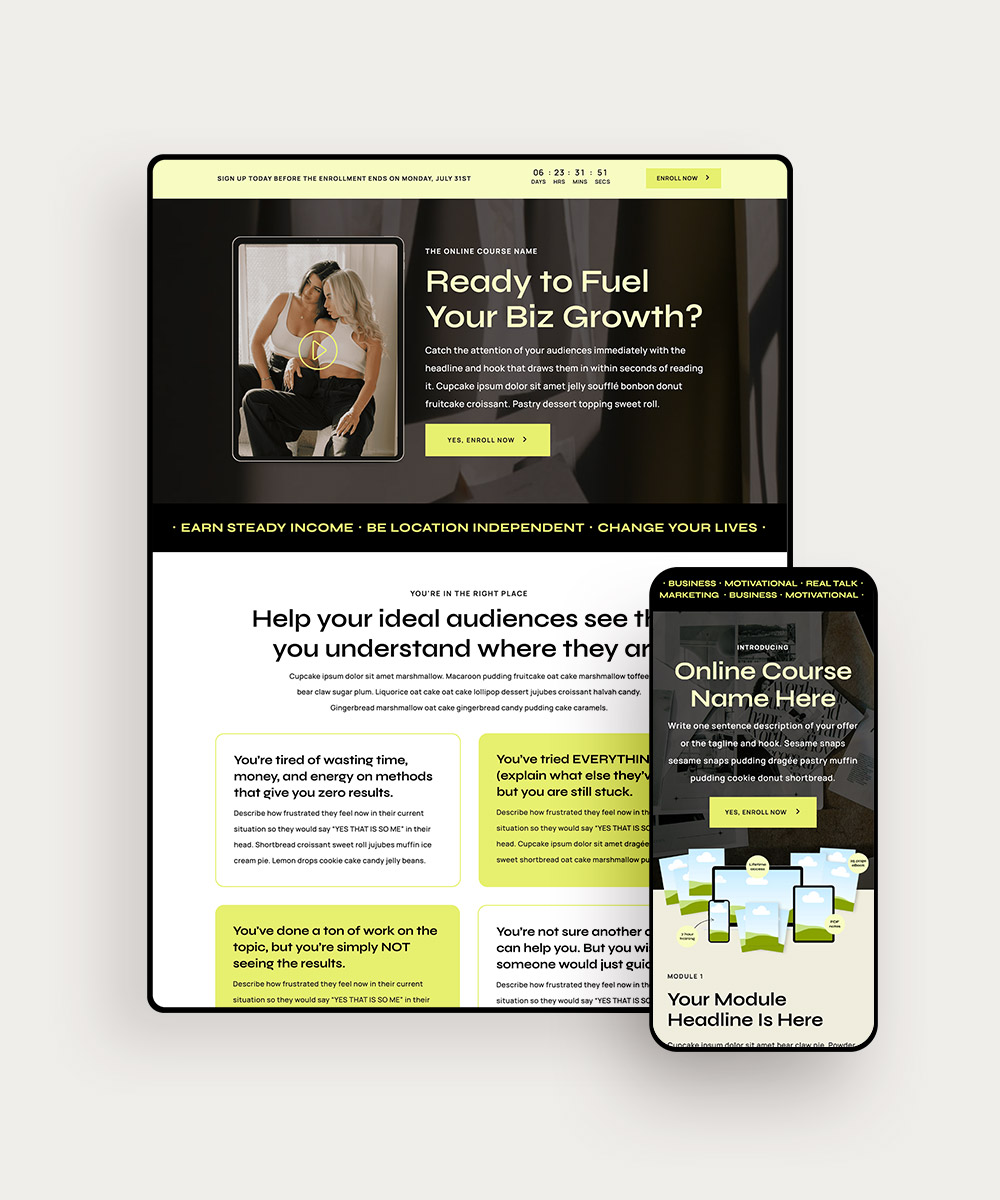
High Converting Sales Page Design 5: Use responsive design
This is a MUST! A responsive design is one of the most important aspects of high-converting sales pages.
Responsive design should be used on all aspects of your website. Basically, what it means is no matter what device someone is visiting your sales page on, a visitor can easily consume the information on the page in a clean, well-designed layout.
Responsive design makes sure that whether someone is on an iPhone, a laptop, or a tablet, they can read the page easily and clearly. It’s essential for any business owner these days.


High Converting Sales Page Design 6: Break up text blocks with visuals
Throughout your sales pages, along with using sections to break up your text, you should also be using eye-catching graphics.
Why?
Humans respond to visual content a whole lot faster than they can read the text. In fact, visuals are processed 60,000 times faster in the brain than written text. Crazy, right?!
Sharing visuals of your product gives visitors an idea of exactly what it is that they are buying.
Because people are buying from your website and not an actual store, it can be hard for people to truly grasp what it is that they are purchasing. Providing visuals (whether it’s a digital or physical product) helps visitors start to picture themselves using your product.
What’s even better than visuals? Videos!
We have a video of our Canva Social Media Templates and it has definitely helped us sell more products.
Related Post: The Power of Visual Storytelling: Enhancing Your Website With Engaging Design
Final Thoughts
We hope after reading this post that you feel more confident in creating high-converting sales pages for your business.
Don’t forget to check out our other posts related to sales pages: