Eek! Are you making these scary website mistakes?
As business owners, you’ve probably had your fair share of scary moments. Like that time your website crashed during a launch, or when you hit “Send” on that email, only to realize you sent it to the wrong person 😱😱😱😱
We also know that so many of you have scary website stories… like when you tried to design your whole site by yourself and it took months to get it launched. Or when you tried to create a new sales funnel and nothing worked.
You’re definitely not alone!
To celebrate the beginning of ~spooky season~ we’re sharing some scary website mistakes that we see all the time, plus some quick tips to help you fix them.
Don’t let these scary mistakes keep you up at night!
PIN THIS POST FOR LATER!


1 | The Missing Audience
Are you focusing so much on yourself that you forget to speak to your audience?
This is super easy to do on your About page because, well…your About page talks about you! While sharing your story can help build trust and forge a bond with your audience, don’t forget to explain how you can help your customers. What will they get out of your relationship?
Related post: Mistakes You’re Making On Your About Page (And How To Fix Them)
2 | A Confusing Labyrinth of Pages
Help, I’m trapped on your site! I can’t find what I’m looking for!!
Content is important, but site navigation and intuitive design are, too. If your site visitors can’t figure out what services you offer, how to search for or filter your products, or how to contact you, they’ll get frustrated and leave ASAP.
(Okay, so you can’t actually get stuck on a web page because of how internet browsers work, but you get what I mean. I’m fully leaning in to the Halloween theme here!)
Related post: 7 Ways To Improve The User Experience On Your Website
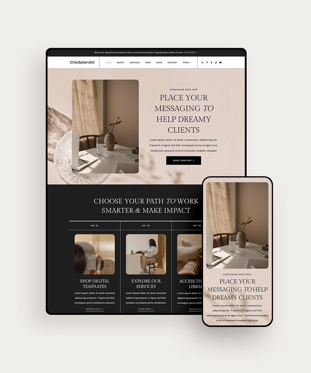
3 | Fearsome Fonts and White Space
Too much text crammed into a space, combined with a poorly chosen font, can frighten readers away from your website. Pay attention to your design choices so that you welcome site users, not scare them off!
You should stick to just a few fonts and assign them to different types of content on your site. One font for headings, one font for subheadings, and one font for body text is my preferred strategy. Use too many fonts and your site looks disorganized and scattered.
As for white space, use more than you think you need. Leave plenty of space between paragraphs and headlines. Give your graphics and images some room to breathe. White space helps your site users focus on one thing at a time.
4 | The Slow Site Speed Nightmare
If you’ve ever visited a new website that took forever to load, I’m betting you never visited that site again.
With so many websites to choose from, your audience doesn’t have the time to wait for yours to load. If it takes longer than 3 seconds to load your site, most people will bounce. Our patience and attention spans are shorter and shorter than ever. Don’t let slow site speed kill your business!
How can you check your site speed? Google’s free PageSpeed Tools and GTmetrix can help.
Related post: How to Speed Up Your WordPress Site
5 | Ghostly Website Pages
Do you have all the website pages you need to sell your products or services? Yes, your Home page and About page are obvious choices, but what about those lesser-known ones? Don’t leave out the following important pages…or they’ll come back to haunt you later.
- The Privacy Policy page. Build trust with your customers and remind them that their information is safe with you.
- The Terms and Conditions page. This one is super important for legally protecting your website and business!
- The 404 Redirect page. Point users in the right direction if they navigate to a nonexistent page. Otherwise, they may just leave.
There are a few more pages you should have on your site, so check out the related blog post below to read about them all!
Related post: The Website Pages You Must Have if You’re an Online Shop Owner
Final Thoughts
Hope we didn’t scare ya too much with these scary site mistakes! Spooky stuff aside, we want to also remind you that websites are hard. They take a lot of work to launch and regular maintenance in order to serve your biz.
So if you’ve made any of these common website mistakes (and you had no idea), don’t feel ashamed. Fixing our mistakes is part of learning how to be a great entrepreneur, right?
If you’re realizing that your site design was the killer (of sales) all along…why not get a website that eliminates all of your worries?
With our Elementor WordPress Themes, you’ll get the pages you need to attract ideal clients — and you’ll get some amazing bonuses to help you avoid the biggest site mistakes that could scare clients off!