As an online business owner, your website is your biggest business asset.
Serving as the hub to promote your business, it’s the ultimate tool to sell yourself and your products or services.
Speaking as an online business owner myself, we wouldn’t even have an online shop if it wasn’t for our website!
Though these days, technology changes at a rapid pace and it can be difficult to keep up with the dos and don’ts of your website.
If you’re looking for small, simple ways to immediately improve website user experience, look no further and read our seven tips.
PIN THIS POST FOR LATER!


Improve website user experience #1 | Check your website speed
Have you ever been on a website that takes forever to load? You probably never visited again, right?
The speed of your site is one of the most important elements to improving the user experience on your website. Nowadays, website visitors expect fast results and won’t wait around for your website to load, so you need to make sure your site loads quickly.
Wondering how to check your site speed? Use GTmetrix or Google offers a free tool called PageSpeed Tools that can test your speed so you can optimize your site.
Improve website user experience #2 | Be responsive and mobile-friendly
Your website must be responsive and mobile-friendly. There’s no way around it. People are accessing your website not only on a desktop but also through their phones and tablets, so it’s imperative for your design to load properly into the different-sized screens that people use.
Google has also started penalizing websites that aren’t mobile-friendly, so if you want to show up in the search results (which I’m sure you do!), you’ll want your website to be responsive.
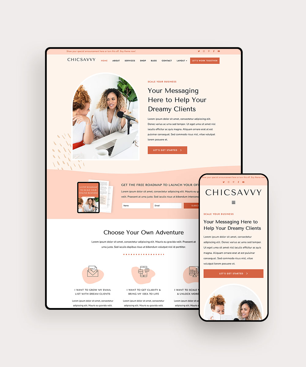
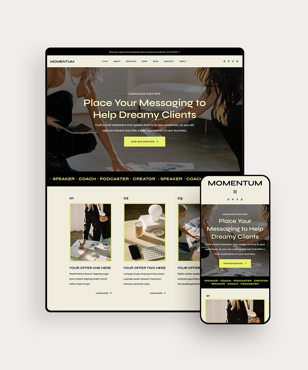
If we haven’t convinced you enough, people are five more times likely to leave your website if it isn’t mobile-friendly. (P.S. all Bluchic themes are responsive and mobile-friendly!)
Related Post: Want to make sure your website looks great on desktop and mobile devices? Follow these mobile optimization tips!
Improve website user experience #3 | Clear and concise navigation
The navigation on your website is the way to guide your website visitors to your top-visited pages and products. The navigation headings should use language that is easily understandable, especially for the brand new visitor to your website.
You also shouldn’t have too many options, as that will overwhelm the user. There isn’t a set number that you should use, but try to keep it in the range of 3-7.
Hailey Dale from The Daring CEO does a great job of this, only featuring four options on her navigation.

Improve website user experience #4 | Use more white space
Though you may be hesitant to use more white space, research has shown that using more white space around headlines and text can increase a user’s attention by 200%. This is because they only have one thing to focus their attention on, instead of being distracted by the sidebar and other content.
A user should be focusing on one thing at a time while on a landing page of your website. Making more room for white space helps the user focus on that one thing (whether it be a piece of content they are reading, signing up for an email list, or looking at a product) so they are more inclined to be engaged with that piece of content.
Related Post: Is your website confusing visitors and hurting your conversion rates? Check these signs + how to fix them.
Improve website user experience #5 | Be consistent
Being consistent throughout your website helps your visitors be able to recognize your brand.
You can be more consistent throughout your website by using your brand colors, writing in the same tone, using the same fonts, and having a similar style and design throughout your website
Inconsistencies in design can leave users confused and not sure if they are on the same website or if they are on a totally different site.
Our WordPress themes help your brand be consistent throughout the entire design and style of your website.
Improve website user experience #6 | Ask minimal information
When you’re asking for information for users to sign up for your email list, you should be asking for the least amount of information as possible.
Most sites now only ask for your first name and email address, which is perfectly acceptable. Once you start asking more than that, though, the chances of someone filling out your form go down significantly.
We live in a fast-paced world and people don’t want to take the time to fill out lengthy forms. Make sure you are only asking for information that you absolutely need.
Related Post: How can you make a marketing plan that’s effective and sustainable? Find out how to streamline your marketing!
Improve website user experience #7 | Improve categorization
Many times when users are on your website, they are looking for a particular category of content. Providing an easy way for users to find the top categories of content on your website will help them quickly find what they need on your site versus giving up and going to a different site.
Elle Drouin categorizes her blog topics at the top of her blog. This helps the user quickly go to all of the posts on any one of these topics without having to search.

Final Thoughts
We hope these tips gives you inspiration on how you can update your website to give the best user experience.
If you’re ready to revamp the entire design of your website, we would encourage you to check out our online shop featuring chic and stylish WordPress themes!