You know how important your website is, especially if you have an online business. Your website is where your audience goes to learn more about you, your expertise, and your offers.
A good website makes a strong first impression on those visitors. It showcases all the reasons they should trust you, highlights the value of your offers, and encourages visitors to join your newsletter, follow you on social media, or make a purchase.
Another sign of an excellent website? It’s simple to navigate. If your website is confusing, visitors aren’t going to waste time clicking around to learn about your offers or find out how to join your newsletter. They’ll just leave.
So, is your website confusing? Use these signs to find out.
PIN THIS POST FOR LATER!


Confusing Website Sign #1: A High Bounce Rate
One of the most obvious signs that your site is confusing is that visitors quickly leave. A “bounce” is when a visitor lands on a website page and then leaves without interacting with any of the other pages.
If this happens frequently, it’s a clear sign that something on your site isn’t ideal. While a confusing design isn’t the only thing that can cause a high bounce rate, it’s a common factor. If you’re seeing high bounce rates, it’s crucial to spend some time identifying and addressing the cause(s).
Want to determine whether confusion is causing your visitors to bounce? You could conduct a user survey to ask how people feel about your site. Another option is to dive into the analytics and see if there are specific pages or navigation paths that show high bounce rates.
Related post: 13 Google Analytics Metrics You Should Be Monitoring and Why
Confusing Website Sign #2: Repetitive Discovery Calls
Think back through your recent discovery calls. Do you find yourself answering the same questions over and over? If so, it might be a sign that your site is confusing.
A discovery call is meant to allow potential customers to ask questions and learn about your products or services. But if visitors consistently ask the same questions over and over—especially if the questions are about your offers or expertise—it’s a sign that they can’t find that information easily on your site.
Think about those questions you hear often and ask yourself some questions:
- Are the answers somewhere on your website?
- Are they on a page that’s easy for a visitor to find?
- Do the answers stand out on that page?
- Is the copy on your About or Services page skimmable?
Use the answers to these questions to figure out what you need to add or change on your website so that it’s easier for visitors to find the information they want quickly.
Related post: Why Create a Resource Page for Your Website?
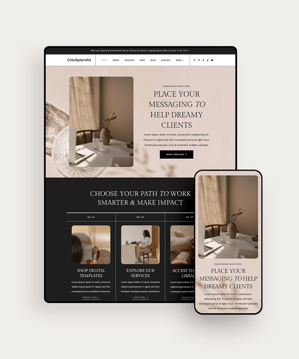
Confusing Website Sign #3: Unclear/Incomplete Navigation
One way you can make sure your visitors find that crucial information quickly is with a good navigational setup. You don’t want them to spend too long trying to find the right page or get lost on a trail of nested links that lead to random pages.
Follow these tips to improve the navigation on your site:
- Develop simple menus.
- Use clear names and descriptions of pages.
- Place navigation elements (menus, links) consistently, so they’re easy to find.
- Include links to essential pages (home, shop, services) on every other page of your site.
- Include a search bar and breadcrumbs
Try to walk through your website from the perspective of a visitor, and see whether it’s easy to find the right pages. You can also ask a friend to provide feedback on your site’s navigation.
Related post: 7 Ways to Show More Personality With Your Website
Confusing Website Sign #4: Low Conversion Rate
Like a high bounce rate, a low conversion is another potential sign that your site could be confusing.
Of course, there are several factors that can impact your conversion rates, so if you’re not making sales, don’t immediately assume it’s because your site is confusing.
Instead, take the time to consider all the possible reasons. Maybe visitors can’t find your list of offers easily. Or maybe they can, but the descriptions are confusing.
Maybe your offers aren’t presented using compelling language and graphics. Or maybe there’s no clear call-to-action encouraging visitors to make a purchase.
Spend some time evaluating the potential issues impacting your conversion rate. But don’t just assume the problem is your offers themselves. It might be something that’s easier to fix, like the navigation or copy surrounding your offers.
Related post: How to Build a High-Converting Sales Funnel
Confusing Website Sign #5: Inconsistent Branding
Inconsistency leads to confusion. If your website doesn’t have consistent colors, fonts, images, graphics, and other branding elements, it can make visitors feel ill at ease.
They might think you are a new company with little expertise. Or they might worry that you just don’t care enough about your brand — or, by extension, your customers.
Do you have brand guidelines? Does your website adhere to them? If not, this is a good place to start updating your website. Clarify your brand identity, and then refresh your site to clearly reflect it.
Related post: How to Create Your Brand Guidelines in Just a Few Hours
Final Thoughts
Now that we’ve covered some of the top signs of a confusing website, how do you feel about your site? Did you spot some of these problems?
If so, don’t fret. You don’t have to scrap your entire site and start from scratch. Just upgrade to one of our WordPress themes! Every one of our professionally designed website templates is optimized for an outstanding user experience.


Featuring clear, intuitive navigation, beautiful aesthetics, and SEO-friendly organization, our themes and templates save you time and money while giving you a gorgeous, conversion-focused website. And because our templates are completely customizable, you can easily incorporate your brand’s colors, fonts, and graphics.
Ready for a website that’s optimized for you and your audience? Shop our full line of WordPress themes to find the perfect one for your site!