One of the first things you learn as an online business owner is that the quality of your website can impact your brand’s appeal and profitability. Your website is often the way you make a first impression on potential customers, so it’s essential to ensure that visitors have a good experience, no matter how they access your website.
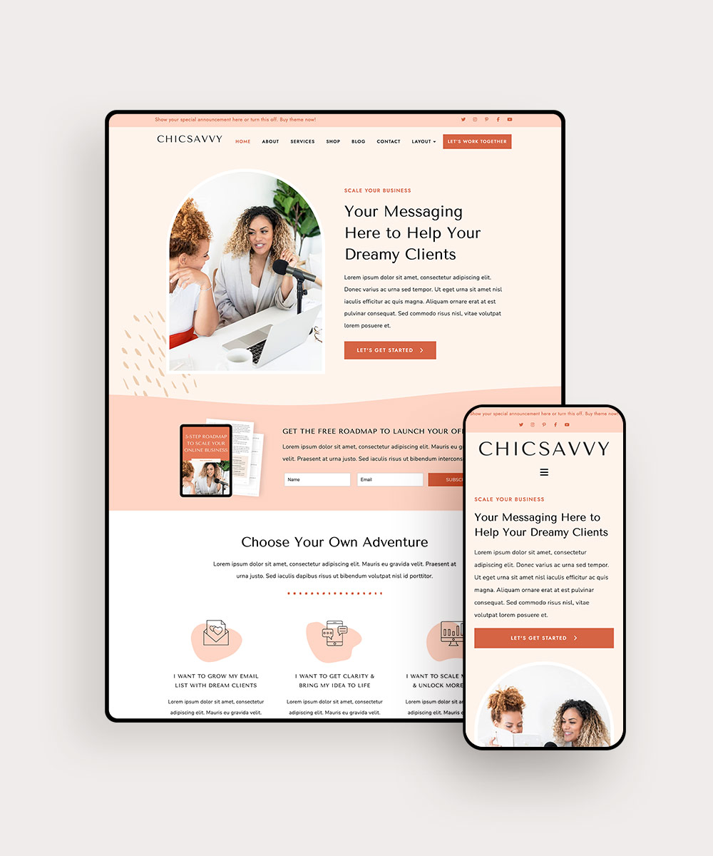
In other words, you need to make sure your website is optimized for mobile devices. Studies show that mobile devices account for about half of all web traffic. So if half of your audience is looking at your website on a mobile device, you want to make certain they have a good experience, just like desktop visitors do.
So, what does mobile optimization look like for websites that sell digital products? We’ve got some tips to help you get the mobile version of your site in tip-top shape.
PIN THIS POST FOR LATER!


1 | Implement Responsive Design
What exactly is responsive design? It simply means that your website adapts to different screen sizes and orientations so it looks good on any device. By incorporating responsive design into your website, you ensure that every page looks beautiful (and functions correctly) on a desktop computer, tablet, or mobile device.
Responsive design is also efficient. By creating a site that can automatically adjust to different devices and screen sizes, you don’t have to worry about creating — and maintaining — separate desktop and mobile versions of your website.
Related post: 5 Ways to Optimize Your WordPress Shop Site
2 | Simplify Your Navigation
One of the challenges of viewing a website on a smartphone or tablet is that the screen is smaller. There simply isn’t enough space to view all the essential elements at once.
That’s why it’s so important to streamline your navigation structure. By doing so, you can save valuable screen real estate for essentials (like your value proposition and CTA) and still make it easy for your visitors to browse everything your site has to offer.
You’re essentially decluttering and reorganizing your website. Put navigation links into a concise, logical menu structure. Incorporate intuitive features, like expandable menus and tappable buttons, to help your visitors find the pages and information they want.
Related post: 5 Signs Your Website Is Confusing Visitors
3 | Reduce Load Times
Is there anything more frustrating than a website that takes forever to load? Actually, yes! It’s a website that takes forever to load on a device that’s gobbling up mobile data or wifi bandwidth.
If your site takes too long to load, many users will simply bounce, especially if they are using a mobile device. How do you avoid this issue? Do everything you can to help your site load faster:
- Compress videos
- Optimize images
- Avoid using too many different fonts
- Minimize redirects
- Use browser caching
It’s also important to ensure that you’re using the correct image formats. JPEG is generally best for photos, and PNG is better for graphics with transparency.
Related post: How to Speed Up Your WordPress Site
4 | Incorporate Mobile-Friendly Content
Mobile optimization isn’t just about taking all the elements of your desktop website and making changes after the fact to allow them to work on other devices. It’s crucial to consider mobile optimization from the beginning!
For example, using skimmable text is always a good idea, but it’s especially crucial if you want to engage mobile users. People viewing your site on a mobile device are likely to scroll and scan text faster than they would on a desktop.
Here are some ways to optimize your site for better skimmability:
- Increase font size
- Shorten paragraphs
- Use bullet points
- Intersperse graphics and other visual elements
No one likes a wall of text, especially on a small screen, so make sure you incorporate breaks and white space.
Related post: 6 Copywriting Tips for Entrepreneurs Who Hate Writing
5 | Refine Interactable Elements
Think about how users will interact with your site differently on a mobile device. Instead of pointing and clicking with a mouse, they’ll swipe or tap. All of those actions should produce the same result if your site is designed well.
Buttons should be big enough for mobile users to find and tap them easily. However, don’t place several large interactable elements in a small space.
A mouse cursor offers far more precision than your fingertip, so having elements close together on the desktop version of your site might not be a problem. But if mobile users are constantly experiencing accidental interactions, they’ll get frustrated quickly. So make sure clickable/tappable elements are enough apart.
Related post: 4 Web Design Mistakes You’re Probably Making (and How to Fix Them)
Final Thoughts
A high-quality website includes beautiful design elements, strong copy, streamlined navigation, and clear CTAs. When the mobile version of your website also includes all these mobile optimization features, you can feel confident that visitors will have an excellent experience no matter what device they use to browse your site.
Ready to optimize your website for mobile visitors? It’s easy with our WordPress themes and templates. All of our products are built using mobile-friendly design and feature responsive performance and integrated features.


You don’t have to worry about learning complicated coding or redesigning your site from scratch. Just pick your favorite theme, customize it with your details and brand elements, and go live! Your site will load fast and look great on any device, helping you make a great first impression on potential customers. Browse our WordPress themes now!