Are you making these 4 web design mistakes? Take some time this week to fix them.
You may have heard me say that everything doesn’t need to be perfect in order to grow. Enjoying the process and learning along the way is just as important as the final look of your website.
The most important thing you can do for your business is to start! It’s what my partner in life and business Andrew and I learned a long time ago as new small business owners with a dream.
It’s the lesson I encounter every day as a girl boss, and it gives me the courage to experiment and come up with brand new themes and WordPress solutions for all of you.
And most importantly, it’s one of the lessons I try to teach our one-year-old son. It’s just true! So get ready to make mistakes and learn.
But if you’d like to skip over a few classic web design mistakes that just about every blogger or business owner can make when they’re first beginning on their journey, I’m here to help you out.
I’m going to tell you about four web design mistakes you’ll want to avoid—and what to do instead.
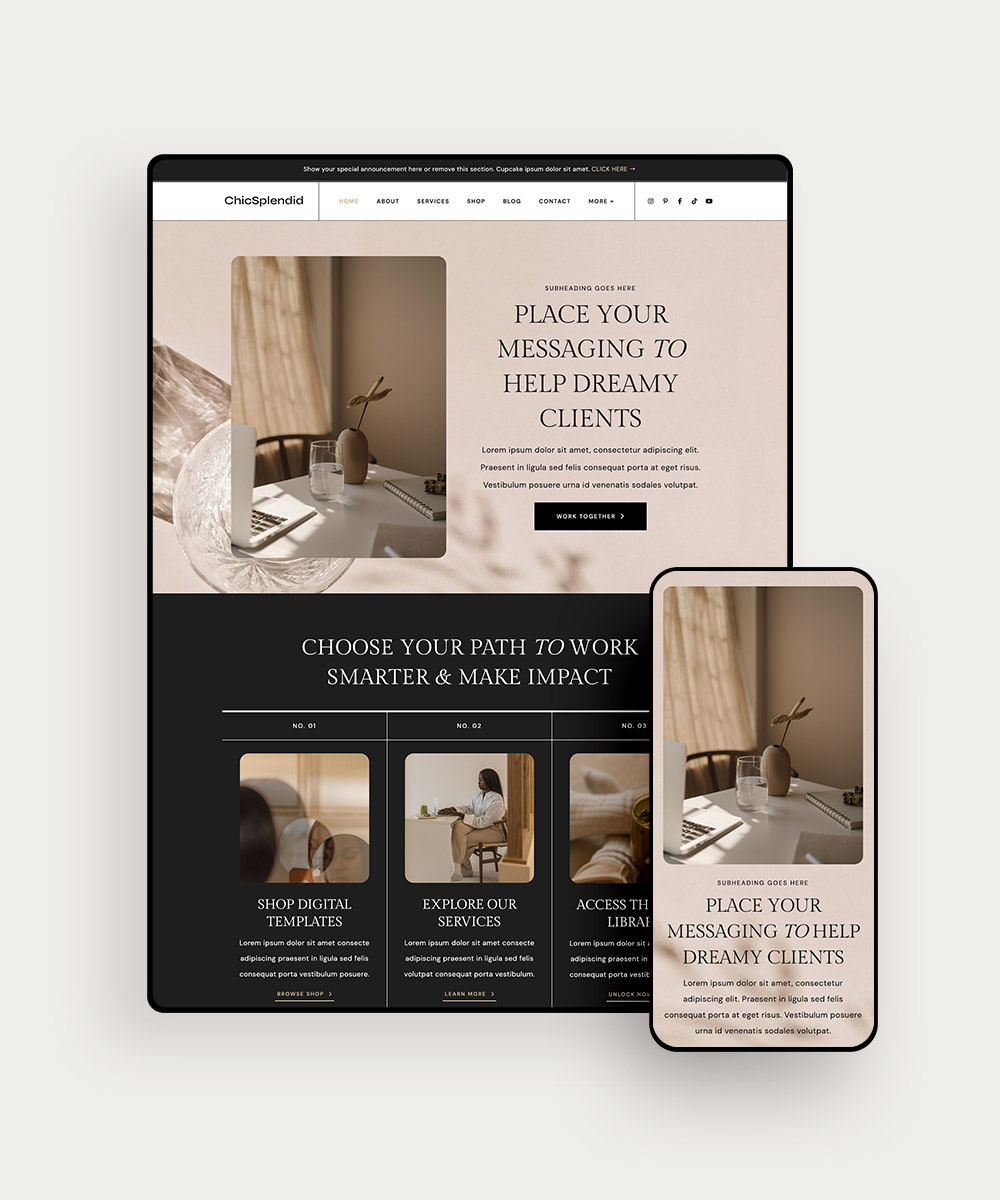
PIN THIS POST FOR LATER!


Mistake #1: Your website is tough to navigate and your visitors can’t find what they’re looking for.
Everyone wants their website to reflect them and be unique. It’s one of the huge perks of owning your own blog or business: you get to carve out your own unique space in the world.
Just remember that if your website is gorgeous to look at but your readers can’t even find your blog, your About page, or figure out how to hire you, they’ll click away.
It’s best to start off with clean, minimalist navigation and offer your visitors a clear description of what you do and the products/services you’re offering. Try to limit the clickable options in your website header to what you absolutely need.
When someone comes to your homepage, it needs to be inviting and easy to get around. This probably isn’t the best time for creative titles for the different pages of your website in your navigation bar or header—that can cause confusion for your visitors! Just make it’s easy to understand for busy people dropping by your blog or website.
Related Post: Improve the user experience on your #website with these 7 tips!
Mistake #2: You forgot to make sure your site is compatible with mobile devices.
In 2015, the brand and consumer research firm Comscore reported that mobile app usage was more common than desktop usage. Half of all digital media consumption now happens on a mobile device!
You’ll need a theme that’s compatible with mobile devices. Your visitors shouldn’t have to zoom in and out to be able to see the text or figure out where they want to go next. Well-designed mobile websites let visitors navigate around with minimal clicks, and use swiping instead.
Crafting mobile-friendly themes is a top priority for us. When you install one of our WordPress themes you’ll know that it will look gorgeous on big screens and small — and you’ll have one less thing to worry about.


Mistake #3: Not using your fonts wisely.
Beautiful font combinations look effortless, but there’s actually a lot for you to think about: which fonts to choose, what kind of spacing, and how many fonts you’ll use.
If, for example, the spacing is too tight, you’re using too many fonts, or you’ve chosen fonts that are too difficult to read, it can make your blog or website much less appealing to your visitors and it will confuse your overall brand identity.
We like to stick to a maximum of three fonts for my websites: one font for all headings, one font for all sub-headings, and one font for all body text, also ensuring that the spacing remains consistent across all types of text.
Thankfully there are plenty of resources out there to guide you! Some of our favorites are typ.io and Just My Type. If you’re feeling unsure, follow the lead of one of these resources, experiment, and learn from there.
Related Post: Does your website have these 6 elements? We share the top elements of a really amazing website!
Mistake #4: Not having a clear call to action for every page.
Ask yourself this question: Do my visitors know what to do after they’ve read every blog post and page on my site?
They won’t know what to do next unless you tell them with a clear call to action. Would you like them to: Sign up for your newsletter? Buy a product or sign up for a service? Book a call with you?
Think about your visitors’ frame of mind as they look around your blog or website. Someone who landed on an old blog post through Google will be less likely to sign up to work with you than a repeat visitor who’s now looking at your About Me page.
You might decide to ask the blog post readers to sign up for your newsletter or free content, rather than spending money on a product or service. If you cultivate a relationship through good email marketing, they’ll most likely be interested in investing in your products or services later.
Once you’ve decided on a great call to action, make sure you emphasize a reason they should sign up, book a call with you, and buy your product or service. Think about why they’d love your newsletter or future blog posts and what they would gain from investing in you, then highlight that for them in a way that’s clear, enticing, and very difficult to turn down.
Related Post: How to Elevate Your Service-Based Business Brand
Final Thoughts
These four mistakes are easy to make, but also simple to fix. Take some time this week to look over your website and make sure that you’re not making these blunders. Remember, your website is your most valuable employee: if it’s presentable, appealing, and easy to deal with it’ll help you book clients while you sleep!
I’d love to hear: what design mistakes have you noticed on other websites that have made you click away? Let me know by tagging us on Instagram!